Work
How-to Guide
Portfolio
Build a Web Page with HTML5 and CSS
Overview
HTML5 is the 5th version of the website authoring language Hypertext Markup Language. HTML5 incorporates the functionality of all previous versions of HTML while integrating new technologies such as text-to-speech, speech-to-text, video, 3-D graphics and more. HTML5 defines structure, layout, and functionality for web pages using characters contained within opening and closing tags "< />" that have attributes telling browsers how to render the web page. External CSS is included in this How-to Guide (hereafter referred to as "Guide") in order to separate content from formatting as recommended by the W3C Style Guide.
The World Wide Web Consortium (W3C) is the standards body who decides, publishes, and implements HTML and CSS rules. Its purpose is to expand website accessibility to more audiences by standardizing web development rules. Adhering to W3C rules increases search engine optimization (SEO) and website visits (theoretically). Web developers and students are the target audience for this Guide. Experience level is beginner. HTML5 is open-source and free, accessible to people willing to learn it regardless of socioeconomic background, culture, language, geographical location, technological skill or physical impairment. It has the potential for expanding users’ information spheres and economic influence concerning commercial or private ventures.
Besides HTML5 integrating new technology capabilities, the other major difference between it and earlier versions of HTML are the <div> container labels. HTML5 uses <head>, <body>, <header>, <main>, <section>, <article>, <aside>, and <footer> container tag labels whereas previous HTML versions used only <div> container labels with classes to differentiate styles or properties for various containers within a website. Classes are still required in HTML5 and it still renders <div> labeled containers. However, older browsers cannot read HTML5 tags and require JavaScript to render properly. Note that although HTML5 and HTML use different naming conventions for <div> containers, they are all still <div> containers. Terms are used interchangeably in this Guide.
This Guide includes instructions for creating a simple HTML5 web page with external CSS. Internal CSS is also demonstrated herein. This Guide demonstrates how to build a folklore essay anthology website for an English student. The styles used for the sample website are appropriate for the content while enhancing SEO (Search Engine Optimization). It is recommended that developers learn basic graphic design principles as they pertain to SEO to enhance site ranking in search engines.
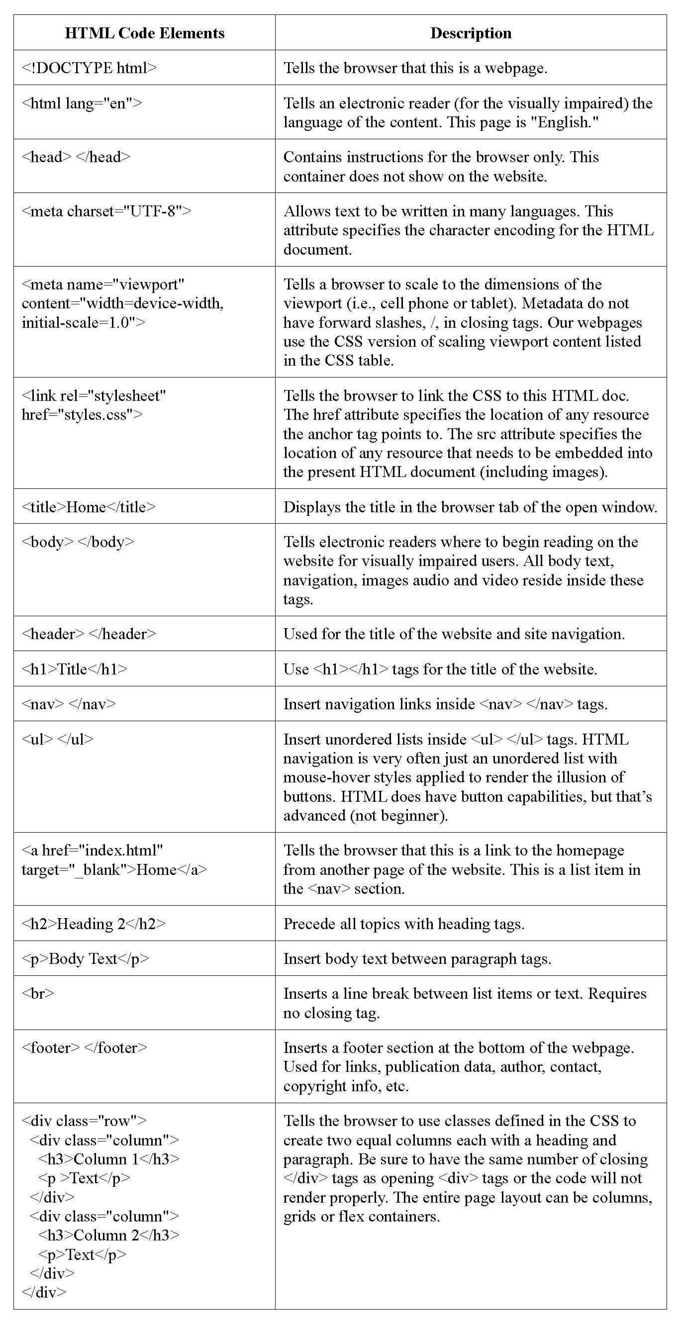
An appendix is included with tables containing HTML and CSS descriptions for some of the code used in this Guide. It is not a comprehensive list of all HTML and CSS code. An online search using HTML and CSS code terms is useful for finding purpose and function of code not listed in the tables.
Create an HTML5 Homepage
Decide Structure, Layout and Content
- Decide which text editor to use to create web pages such as Notepad, Notepad++, VSCode, etc. Many options are available online and some are downloadable.
- Write the content for the website. Content should be written in a word processing program to spell/grammar check before insertion into the text editor because spellcheck is not a function of text editors.
- Collect the images to be used in the website. Images are usually saved in an "Images" folder within a folder hierarchy for a website.
- Decide the structure and layout of the web page (grids, columns, flex containers, etc.). Content usually determines layout.
The structure of this site uses stacked and nested containers with body text and images. Two columns are used in the footer with CSS @media used to stack columns vertically in smaller viewports for demonstration purposes.
Create the Homepage
- Create the index.html page and save it in a new folder. Notepad is used in this example.
- Open Notepad. Save as: "index.html." Save as Type: "All Files."
- Close the index.html file. Right-click the file. Open with: Notepad.
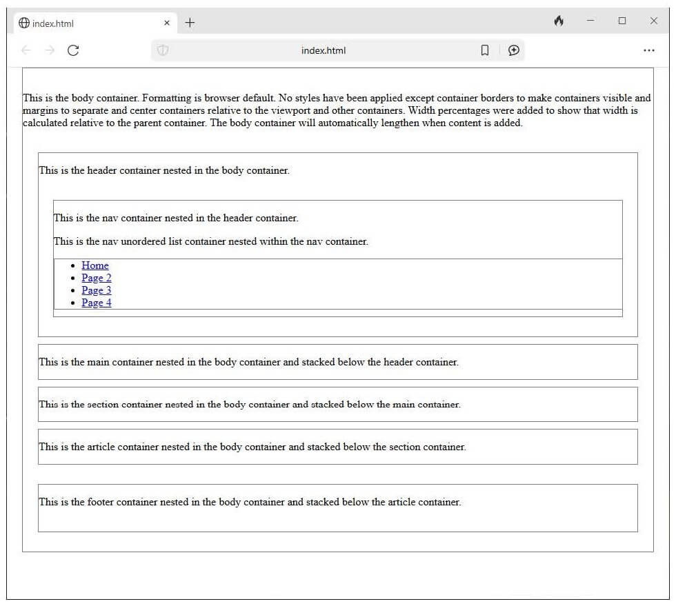
Below is an example of a simple HTML web page structure. Notice how the header, main, section, and article containers are nested inside the body container and how the opening and closing tags are ordered inside each element (from the outside in). These are <div> containers nested in correct order. Nesting containers can result in narrow paragraph and column displays on small viewports like cell phones. Therefore, it is recommended to only nest one or two containers deep unless a layered effect is desired in the final design. Otherwise, use stacked containers to ensure that all content displays properly regardless of viewport size. Using CSS @media will stack grids, columns, flex containers and navigation vertically in smaller viewports. This Guide will use one two-column element to show how CSS @media renders on smaller viewports.
Note: Be sure and put the @media rule after the element it is styling (e.g. body, columns, nav, etc.) in the CSS because the order of precedence applies. If @media is formatted properly and is not working it is because it is placed before the element it applies to in CSS.
Alternatively, removing the "width=device-width, initial-scale=1" of the HTML viewport meta tag without removing the entire tag lets users double-tap the screen to automatically zoom in and out. There is more than one way to do everything in HTML and CSS.
Example of Stacked and Nested Containers Structure
The example below uses an internal CSS between <style> tags in the <head> container of an HTML page created in Notepad. The internal CSS (everything between the <style> tags) can be copied and pasted into Notepad, saved as styles.css and linked to create an external css. This example shows the format of CSS whether internal or external.
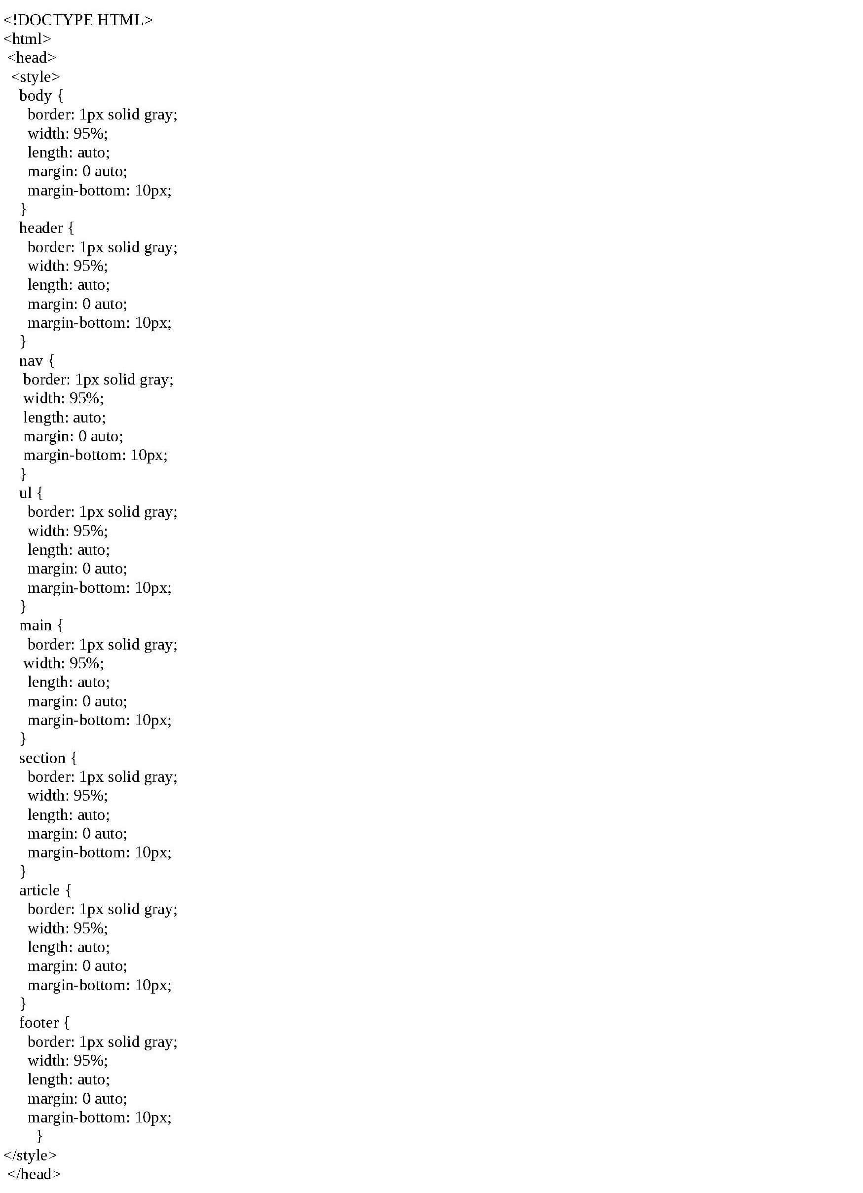
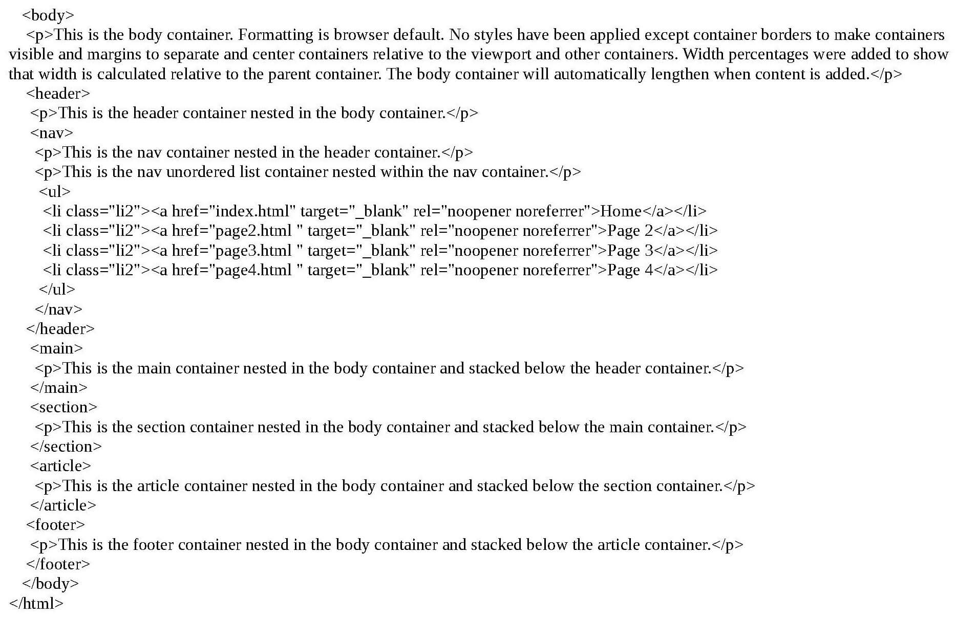
Example of Rendered HTML and CSS Code
The example below is the code (shown above) rendered in a browser. Normally, the page would be blank because containers do not show on a web page without styling. Borders were added to reveal the dimensions of containers on the page. Padding and text were also added to expand the containers. Because this is a responsive web page, containers are collapsed until expanded with content and styling.
Create Navigation
- Insert the navigation <nav> </nav> tags inside the <header> </header> container.
- Insert secondary navigation in the footer to improve SEO (optional). This can be a sitemap.
Note: Web developers will often put the <nav> container in a left column or grid container. The example website used in this Guide uses the header for navigation.
Insert Content tags
- Create content tags within the container tags and insert content (example below). Content tags include paragraph, image, list, table, column, media, etc., tags.
- Build every section of the Homepage so that all elements of subsequent pages will preexist and not need to be manually recreated for every single page. Subsequent pages will be copies of the Homepage, but modified for different content.
- Use an opening < > and closing < /> (single angle quotations and forward slash) for container and content tags in HTML so that content renders properly.
Insert Spacing
- Add one to five spaces before every opening tag in HTML to indent sections in order to make it easier to find specific elements when editing code (optional). Some coders use tabs to indent. While W3C and Google recommend not using tabs, there is no standardization for HTML spacing. Hard returns (blank lines) and spaces to separate elements do not render in HTML. Spacing is coder preference.
- Ensure that lines of code are short so that scrolling to edit code is unnecessary. Most text editors and hosting domains have a wrap feature for code, but not all.
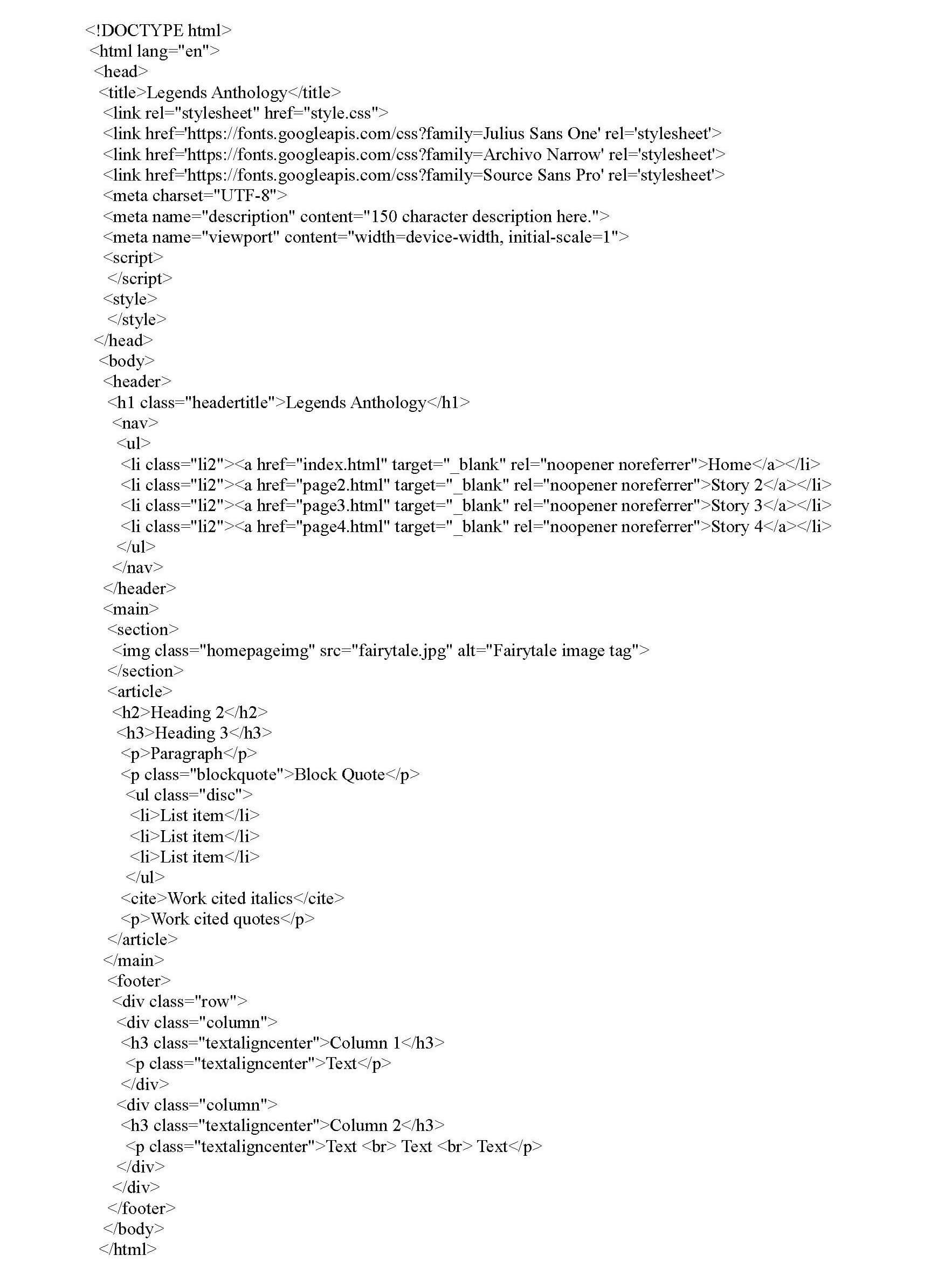
Example of Containers with Content Tags
Below is the code for an essay anthology website with containers, content tags and linked navigation, but no content. Only the homepage structure has been created so far.
Example of Web page with Content Example
Below is an example of a complete web page with content. Only the homepage content is complete to show how the CSS renders the page. Subsequent pages are created and linked in navigation, but no content except for images has been added. Site structure is complete. (The Notepad file with HTML and CSS code but no content can be downloaded from the Blog page.) Click the button below to view the sample website.
View Folklore Essay Anthology WebsiteCreate Subsequent Pages
- Copy the index.html file and paste in the same folder (index.html is always the Homepage and tells the browser that the site begins with this page).
- Save as "page2.html" (as an example). Repeat for the desired number of pages naming in sequential order. Be sure and use lowercase letters with no spaces when naming files in HTML. Browsers do not recognize spaces in HTML filenames. While browsers do recognize uppercase letters in filenames, Unix and Apache web servers will not display HTML files beginning with uppercase letters. However, capitalizing the first letter of subsequent words is acceptable (e.g. "ghostShipPage.html").
- Link subsequent pages in the <header> section inside an unordered list that is nested in the <nav> container. The links have already been created for this web page. Ensure subsequent page names in the navigation are identical to filenames so that the links work. This is the site’s navigation.
Understand IDs and Classes
Understanding the use of classes and IDs in HTML and CSS is important because CSS applies formatting to all elements with the same tags in HTML uniformly. This means that if developers need to apply different formatting for one <div> container, but not others, they would need to create a class for that <div> container specifically. Use classes for elements in an HTML web page that appear repeatedly (e.g., lists, headings, paragraphs, images, etc.). Use IDs for elements in an HTML web page that appear only once (e.g., header and footer containers). For every class and ID designation, there will be two code entries: one in HTML and one in CSS.
Create an ID
Below is an example of an ID code entry in CSS and HTML. The result will be the title (Heading 1) of the website in the header being styled uniquely from all other text on every web page. There is only one website title on every page. (Note: The word after the "#" and "." representing ID and class, respectively, is invented (made-up) by the coder.)
CSS code entry:
#topHeader {
background-color: transparent;
color: black;
padding: 30px;
text-align: center;
}
HTML code entry:
<h1 id="topHeader">My Header</h1>
Create a Class
Classes are used frequently in CSS and HTML. Below is an example of a class code entry in CSS and HTML. The result will be a block of text with a gray background color being fully justified and indented within its container to set it off from the body text.
CSS code entry:
.blockquote {
background-color: #f2f2f2;
padding: 20px;
margin: 10px 20px;
text-align: justify; }
HTML code entry:
<p> class="blockquote">Paragraph </p>Create an External CSS
Structure of CSS
CSS uses different opening and closing tags than HTML. These {} are curly brackets. Rulesets in CSS do not need to be in any specific order like HTML, but the syntax is important. Once created, the CSS is linked to the HTML doc. It contains the formatting for the website. Note: If styles have the same specificity (e.g., "h1" padding has two entries in the CSS), the latest or last entry in CSS takes precedence. Order of precedence for selectors is: tag, class, id, internal styles, inline styles. This guide does not use internal, which would be placed inside HTML tags.
Create an External CSS
- Open Notepad. Save as: "style.css." Save as Type: "All Files."
- As in HTML, do not capitalize or use spaces when naming CSS files.
- Be sure the CSS is linked in the <head> container of the HTML doc.
Use this code: <link rel="stylesheet" href="style.css">
Test the Site
- Open the index.html file in a browser (double-click) to visually inspect layout appeal when rendered.
- Check alignment of all elements (containers, text, images, etc.).
- Click all links throughout the site to verify functionality.
- Make necessary adjustments.
Common Mistakes
The most common mistakes developers make are:
- Forgetting to add closing tags to a line of code. This results in code that does not render properly.
- Forgetting to change the <title>Home</title> tag in the <head> </head> container for subsequent pages. This results in every open tab being titled "Home" when titles of tabs should change on every page according to content. Only one Homepage exists in a website.
- Forgetting to add the file extension (e.g., ".html") when linking subsequent pages to the website.
- Naming links differently than source file names. If subsequent page links are not working when clicked from the Homepage, the name of the page in the link is inaccurate. An easy way to capture the file name is to right-click the file, select "Rename," Ctrl + C or copy, then paste it in the link. Remember that all link names must be identical to the source file name. Do not begin the first word of a page name with a capital letter or use spaces in page names. Use dashes or underscores to separate words if desired.
- Deleting an end tag or a line of code accidentally. Use Ctrl+z to Undo and Ctrl+y to Redo. In Notepad, this only works for the last action performed.
Conclusion
It is best practice to use an external CSS instead of internal CSS. An external CSS is linked in the folklore essay anthology website example. Formatting (CSS) and content (HTML) should be separated for two reasons. Firstly, the problem with using internal styles is that developers will have to find and edit the same CSS code on every single page of the site manually, which is time consuming and tedious. Secondly, linking an external CSS means that developers only make one change in the CSS for the changes to automatically cascade throughout all pages of a website after saving. The second option is much more efficient.
All browsers have built-in HTML formatting meaning that HTML web pages will display and function without CSS. However, formatting will display differently in every browser and will not render as nicely as with CSS formatting. Also, while it is possible to omit all containers except <body> containers and to place all content inside the body element, all content should be placed inside separate <div> containers so that it can be styled and aligned differently without having to use a multitude of classes.
Once developers have built several websites with different layouts, copying and pasting sections of code from previous projects is more efficient than manually typing code. However, for developers who would rather use graphical user interfaces (GUIs), Adobe Dreamweaver, WordPress.com, Wix.com, and Godaddy.com use GUI drag-and-drop templates to create websites. HTML and CSS are not GUI environments. Typically, developers use content management systems like WordPress for dynamic sites and HTML, CSS and JavaScript for static sites.
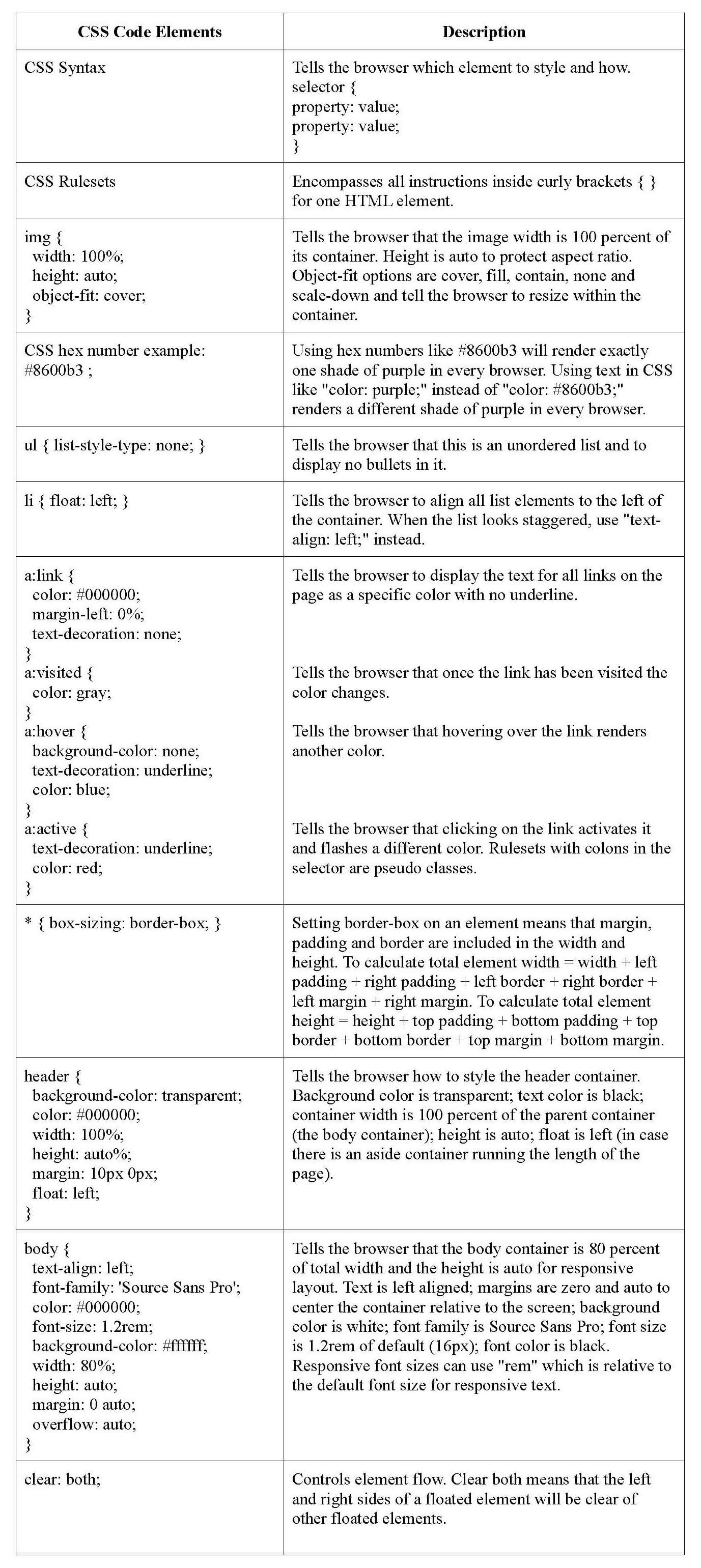
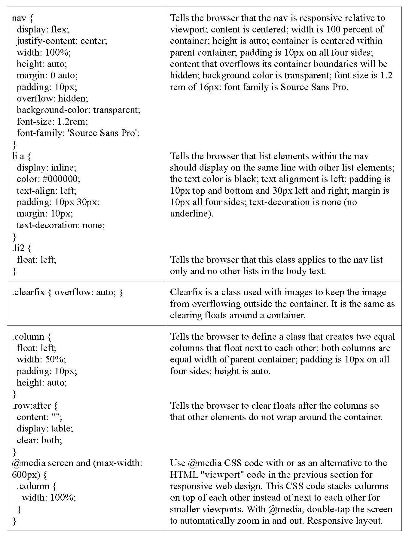
Appendix
HTML (Hypertext Markup Language) Descriptions
CSS (Cascading Style Sheets) Descriptions